
The visitor decides in eight to ten seconds whether the page is legit or whether they should hit the back button. That sentence is the entire frame for sales-landing-page work, and most pages fail that test before the visitor scrolls a single section. The reason is structural: the page was built from a template instead of from the buyer's reality. Cramming every feature and buzzword into a hero, then asking a cold stranger for a commitment, does not produce conversion. It produces a pretty bounce rate.
This essay is the practitioner playbook for sales landing pages that feel like a smooth sales conversation. The sub-service explainer for the Sales Landing Page tile in the homepage Sales & Growth silo. Companion pieces: Conversion Funnel Design covers the upstream architecture that determines what each landing page is supposed to accomplish; Conversion Rate Optimization covers the discipline that compounds page lift over time once the page is live.
The eight-second judgment is real and it is mobile-first
Andy's portfolio framing on the eight-to-ten second judgment was load-bearing in 2020. In 2026 it is tighter. Most B2B cold traffic now lands on mobile, where attention spans above the fold compress to three to five seconds. High-converting B2B landing pages routinely complete the conversion above the fold for their highest-intent traffic, with form-top layouts and short one-to-three field forms converting well above the benchmark averages for B2B dedicated pages, and far above homepage-as-landing-page setups. Every additional second of page-load latency costs conversion. The page does not have until the visitor scrolls; the page has until the thumb starts to swipe.
The discipline that survives this envelope is direct. The first belief (this page is for me) has to land before the user has consciously decided to keep reading. The proof points have to load instantly. The form, when one exists, is short and present. The navigation and the visual noise that compete with the conversion are removed. Andy's verbatim discipline applies: Mobile-first, skimmable, and built around a single, clear call to action. The full-site header with twelve nav links that 68% of "optimized" landing pages still ship is the single largest avoidable conversion drop. Each extra above-the-fold link drops conversion by roughly 11%.
The page goal matches the traffic, or the page underperforms
The structural failure mode beneath template-stuffed pages is one-page-for-everything. The same hero band, the same feature grid, the same CTA, served indiscriminately to traffic from cold paid social, warm SEO content, hot email recipients, referral clicks, and direct returns. Every traffic source brings a different intent level and a different awareness state. The page that pretends they are the same conversion target underperforms on all of them simultaneously.
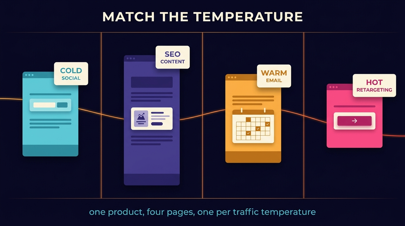
The framework that fixes this is page-goal-traffic match. Each traffic source gets a dedicated landing page tuned to that source's intent. Sites with many dedicated landing pages generate substantially more leads than sites running one general page. The math is mechanical: matched intent produces matched conversion; mismatched intent produces bounces. Andy's portfolio language is explicit on this: choosing the right offer for this traffic (free lead magnet, paid audit, strategy call, direct sale) and structuring the page so each section earns the scroll. The offer scales to the temperature.
Four common pairings.
- Cold paid social to free lead magnet. The visitor does not know you. The ask is small (an email for a useful artifact). The page is short, the form is one or two fields, the proof is a piece of the artifact itself. Conversion benchmarks land at 15-25% on warm-segmented audiences, lower on truly cold.
- Mid-funnel SEO content to paid audit or assessment. The visitor has already self-identified as problem-aware (the search query proves it). The ask is a paid micro-commitment ($49 audit, $97 assessment, free 30-minute diagnostic). The page front-loads expertise and risk reversal. The Accounting case study is the clean example: a $49 audit landing page that produced roughly $80K in collected revenue inside 60 days, much of it from clients who started with the audit and converted into higher-ticket retainer engagements.
- Warm email to strategy call. The visitor knows you and clicked through deliberately. The ask is the call. The page handles the specific objections that surfaced in the email sequence, restates the value of the call (not the value of the product), and presents the calendar with one or two qualifying questions. Conversion benchmarks at 25-40% on a healthy warm list.
- Hot retargeting to direct sale or trial. The visitor has already engaged with the product surface. The ask is the purchase or the trial. The page assumes product-aware and emphasizes risk reversal, social proof at the buying stage, and clarity on what happens after the click.
The Kitchen Gadgets case study demonstrates the discipline at the radical end. Three structurally different landing pages were built for the same product (an avocado slicer), each expressing a different narrative, layout, and offer structure. Budget split across all three. The ugliest page won by a wide margin and produced roughly $600K in sales over 60 days. The lesson is not "ugly pages convert." The lesson is that one-page-for-everything is the dominant trap, and the operators who escape it find conversion economics the template-bound competitors cannot match.
Five beliefs, one page, in order
Once the page-goal-traffic match is set, the page architecture follows a five-belief sequence. Each section earns the scroll by updating a specific belief the visitor has to hold to keep reading. The order is non-negotiable. Each belief depends on the one before it landing.
Belief 1: This page is for me. The hero is the eight-second test. The headline names the specific buyer, the specific situation, or the specific outcome they came looking for. Generic hero copy ("Grow your business with our platform") fails this test. Specific hero copy ("Solar installers running paid acquisition without a clear handoff between media and field ops") passes because the right buyer recognizes themselves and the wrong buyer keeps scrolling on someone else's tab.
Belief 2: You understand my problem. The first scroll-down section restates the problem in the buyer's own language, drawn from the Lexicon of Pain (the verbatim phrase library extracted via the discipline in Conversion Funnel Design). When the buyer reads their own internal monologue back to them, defenses drop. The vendor stops being a vendor and starts being someone who has clearly seen this exact problem before.
Belief 3: The path you're proposing is the right one. The middle of the page describes the approach in concrete terms. Not features. Not bullet-point lists of capabilities. The mechanism by which the visitor moves from where they are to where they want to be. The clearer the mechanism, the more credible the path. The Accounting $49 audit page worked because the audit itself was a small, observable, useful artifact that proved the larger path was sound; the page did not need to convince the buyer of an abstract methodology because the audit was the methodology in action.
Belief 4: The risk of saying yes is lower than the risk of saying no. Risk reversal lives here. Guarantees, refund policies, the specific outcome you commit to, the specific cost of doing nothing, the social proof at the right precision (testimonials from buyers who looked exactly like this visitor, not testimonials from generic happy customers). Risk reversal is not "money-back guarantee" boilerplate. It is the section that does the actual psychological work of making the no scarier than the yes.
Belief 5: Yes. The CTA. Singular. One ask, repeated at the natural decision points. Not three different CTAs competing for attention. Not a CTA buried below the fold under a feature grid. The button that completes the sale, present where the buyer's belief sequence has earned the right to ask.
Every section earns the scroll or it gets cut
The discipline that holds the architecture together is brutal. Every section on the page passes one test: does this section update a belief the visitor needs to hold to keep reading? Sections that fail the test get cut, even when they look pretty, even when the design team will be sad. Animation that does not communicate a belief is not a section. The team intro that nobody reads is not a section. The features grid full of capabilities the buyer did not ask for is not a section. Each piece of pixel real estate is judged on whether it moves the buyer one belief closer to yes.
The High-End Men's Fashion case study walked through this discipline in extreme form. The original site was a fashion-award entry: animations, heavy visuals, beautiful brand expression, zero clarity. Cold-traffic conversion under 1%. The fix was not adding more sections; the fix was replacing the entry experience entirely with a $40 keychain bundle page that ran the five-belief sequence cleanly, then upsold the $400-$500 jeans on the post-purchase surface. Conversion cleared 4%+ on the cold-traffic bundle flow. The brand's aesthetic survived because it was supporting the offer instead of replacing it.
Andy's discipline names this directly: Mobile-first, skimmable, and built around a single, clear call to action. Skimmable does not mean shallow. It means the first scan of the page produces the belief sequence, and the deeper read confirms it. The page works for the three-second scroller and the three-minute reader simultaneously, because the section structure carries the argument and the prose carries the depth.
The template tradeoff in 2026
Framer, Webflow, Unbounce, Lovable, and the wave of AI-generated landing-page builders all argue the same thing: ship in a day, A/B test the variants, let the algorithm find the winner. The argument is partly correct. Templates ship fast. They cap at roughly 6.6% median conversion. They are appropriate for early-stage validation and for offers where the LTV does not justify custom engineering. Custom-built pages with matched-traffic discipline routinely reach 30%+ conversion for high-intent traffic. The gap is real.
The decision rule is straightforward. For offers below $5K LTV with under 1,000 monthly conversions, ship a template, run two or three quick A/B tests, accept the median conversion benchmark, and put the operator energy elsewhere. For offers above $5K LTV with 1,000+ monthly conversions, the custom build pays back inside a quarter because every conversion-rate point compounds against six-figure or seven-figure annual revenue. The Accounting $49 audit work is the threshold case: the audit itself was a low-LTV entry point, but the ladder it unlocked (full retainer engagements at $5K-$15K monthly) was high enough that the custom build paid for itself many times over.
The 2026 wrinkle is that AI-generated landing-page tooling now lets a template-quality page ship in hours with reasonable copy and acceptable design. The bar is rising on what counts as "below the threshold for custom." Operators who ship the template fast and then layer custom belief-sequence work on top once the offer proves itself end up with the best of both: speed-to-market on the validation, conversion economics on the scale.
Where to start
Three starting points, in order of difficulty and impact.
Easiest, do today. Open your highest-traffic landing page on a phone. Count the links above the fold (full-site header, body links, footer if visible). For each link, ask: does this link serve the conversion, or does it offer the visitor a way to leave? Remove every link that does not serve the conversion. The benchmark says 11% conversion lift per removed above-the-fold link. The change takes ten minutes and ships a measurable improvement before the next ad spend cycle.
Medium, this week. Identify your three highest-volume traffic sources (paid social, SEO, email, referrals, retargeting). Build or split into one dedicated landing page per source, each with an offer matched to the source's temperature. Use a template if speed matters more than conversion ceiling. The lift from page-goal-traffic match alone typically lands in the 30-100% range over the prior one-page-for-everything baseline.
Hardest, this month. Rebuild your highest-stakes page (the one driving the most LTV-weighted traffic) from the five-belief sequence. Pull the hero from the Lexicon of Pain. Write each section to update one belief. Cut every section that does not pass the belief test. Ship custom, not template. Run the new page against the prior page as a structured A/B test (per the discipline in Conversion Rate Optimization). The first iteration will not be perfect; the second iteration, written from the analytics of the first, will outperform anything the template path could have produced.
A sales landing page feels like a smooth sales conversation. Each section earns the scroll by updating one specific belief in the visitor. The page goal matches the traffic; one-page-for-everything is the dominant trap. The five beliefs land in order, the hero passes the eight-second test, the navigation gets out of the way. Templates are appropriate for validation; custom builds compound at scale. For the upstream funnel architecture and the downstream A/B-testing discipline, see Conversion Funnel Design and Conversion Rate Optimization.